On September 13, 2011, Microsoft unveiled and showed in great detail the new Windows 8 Operating System. Here are the details of the new User Interface (UI) of the new OS:
First, let me point out that there are TWO DISTINCT User Interfaces in Windows 8. One is the old, familiar user interface with the task bar, the desktop, and resizable windows. That won’t change and that stays, and there are even some improvements on that side.
Click here to follow me on Google+.
This article is one in a series. Click here for the full index.
The OTHER UI is the new “Metro” UI. If you’ve seen a Windows 7 Phone (and I’m assuming most of you haven’t since it’s soooooooooooooooooooooooooooo unpopular), I’ll point out that it’s like the Windows Media Center interface. You have a bunch of tiles on a screen. It’s a UI designed for something more like a DVR interface on a TV. Tiles are somewhat the equivalent of application icons, but much MUCH bigger and will have live, updatable data in them. For example, your e-mail app icon will likely have the number of unread messages in it.
Note that the Metro UI is designed with “Touch First” intentions. The entire UI is designed so that it’s easy to use in a touch environment and ALL of it is touchable. There’s nothing you’ll HAVE to switch to the keyboard or mouse for. BUT, the keyboard and mouse are FULLY supported too. If you don’t have a touch screen (and who does for the home PC or notebook, right?) you can FULLY use your mouse and keyboard.
Oh! One more thing. This Metro UI is designed with touch tablets in mind, but it IS the default UI no matter whether you’re using a touch tablet, a notebook, or a desktop PC.
Below are some images of the new UI with explanations…
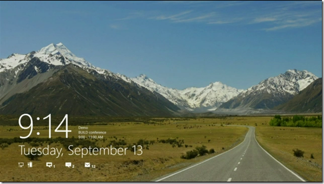
Above is the “Lock Screen”. When you’re not using your computer, this is what is shown. As you can see, there are some status icons on there, which could be a potential security threat. Do you really want people knowing you have unread e-mail and unread IMs and how many of each? Probably not a big threat, but still, this is information that has the potential to cause harm. For example, a malicious user could determine whether it’s been a long time since you’ve checked your e-mail. They could see this number drop, and thereby know you’re logged on somewhere else. They can determine your activity just by monitoring your lock screen. I’m assuming this is customizable and that you can remove them if you wish.
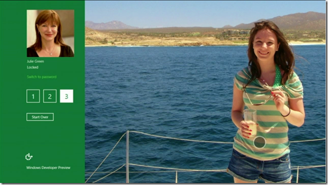
Above is the logon screen. There are multiple ways to log on. In the example above, this is the photo log on. “Julie’s” logon photo is a photo of her daughter, she touches her daughter’s nose, then her drink, then swipes across the rope behind her daughter, and then she’s logged in. You can use a plain old password of a 4 digit pin if you like too.
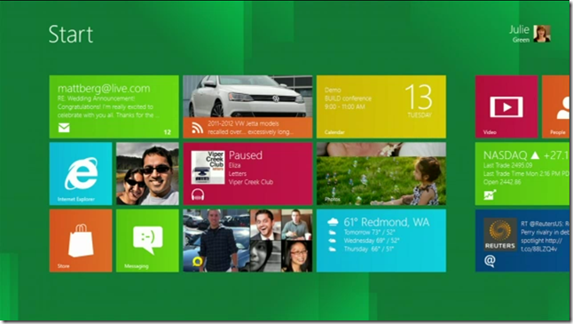
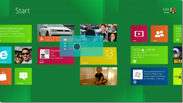
Above, is the new “start screen”. This is the replacement of the old, familiar desktop. All your app icons are here, in groups that you make. You slide your finger (or mouse, or touchpad) left or right. Each icon is called a “tile”. Tiles can have life data updated in them like number of unread messages for your E-Mail app icon or the current weather on your weather app. You can pinch to zoom in or out. You can rearrange tiles by touching one, holding, then dragging it to a new location.
This part’s cool:
You can hold the icon with one finger, then with your other hand, pinch to zoom out, (without letting go of the icon with your other finger), you can then drag it to a different location in the same or a different group.
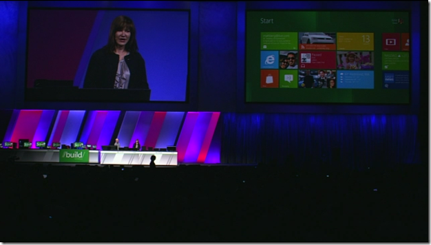
Julie and Steven on stage demonstrating the Metro UI.
This is an example of Julie dragging the Weather app tile to a new location. The tiles underneath respond to show where the dragged tile will be dropped, if you let go.
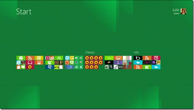
Julie’s apps tiles zoomed out. I’m not too keen on this. I’m a developer and have LOTS and LOTS of apps and icons. I’m not sure this horizontal structure is sufficient for me. I’ll be swiping and swiping and swiping. They need to let me stack vertically too.
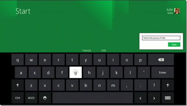
On-screen keyboard for touch typing. You can continue to use your physical keyboard. This is really intended for tablets. Spell check is EVERYWHERE in the Metro UI, BTW, which is pretty cool! There’s even an option to have the keyboard split with half the keys on the far left and the other half on the far right with the intention that you’re holding your tablet with both hands and are typing with your thumbs.
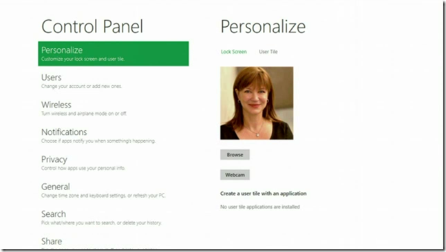
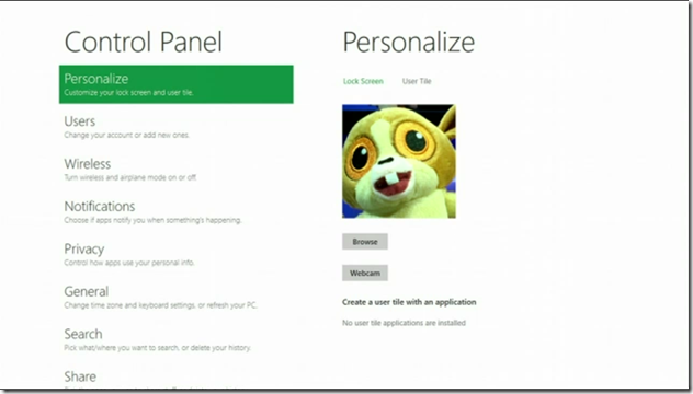
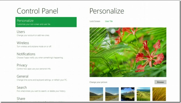
The Control Panel in the Metro UI. All touch enabled.
Julie using the notebook’s front facing web cam to take a new profile picture.
Her profile screen with her new profile pic.
Changing her lock screen image.
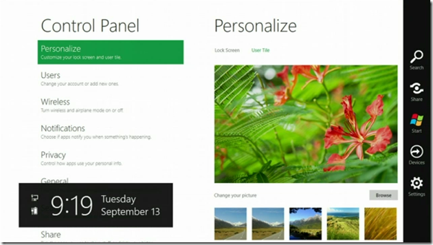
Swipe from the right and get the standard menu from anywhere.
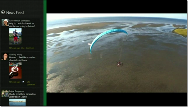
“Docking” two apps on the Metro UI screen. Unlike what we’ve become accustomed to since 1984, you don’t have dragable windows with defined and resizable borders that can overlap, everything is always full screen. There is no background. So, apps will always stretch to fill up all screen space. This is showing a video player on the right and a custom app, for demo purposes only, that shows a social network news feed docked on the left. You can drag that green bar to resize both apps. Options here are severely limited. Fortunately, the old Windows 7 desktop user interface is still available with the touch of a Windows-Key combination. But, Metro apps only run in the Metro UI and regular Windows apps only run on the regular Windows UI. There’s no cross-breeding.
This is Internet Explorer 9 running as a Metro app. Again, it’s always full screen, unless you have a docked app on the left. It does scroll impressively fast which brings up another nicety:
Graphics Speed:
ALL of the Metro UI uses your hardware’s GPU (Graphics Processing Unit) to speed up all displays. They demoed this on about a dozen computers from a monster with tons of RAM and a super fast, 8-core CPU down to an ARM based tablet, and they’re all fast on screen updates and swipes.
My Opinion:
This Metro UI is kind of neat for tablets, but I can’t imagine using this for my day to day work. I’ll certainly play with it once I get it up and running, but for actual work, I’ll likely be spending 99% of my time (or probably more) in the standard Windows 7 UI where I have MUCH more control over my experience. Metro UI is far to “appliance like” with limited usability.
What about the iPad? I believe Microsoft has a viable competitor to Apple’s iPad and since all devices now support the Metro UI (desktops, notebooks, tables, and phone, and to some degree, XBox 360 with the Windows Media Center interface), they’ve got a whole ecosystem where people will be exposed to this UI and will become familiar and comfortable using it. Imagine in the not too distant future, someone using Windows 8 (or whatever they’ll call it then) with the Metro UI, then going to BestBuy to buy a tablet. There’s the iPad, multiple Android tablets, and a Windows 8 tablet with exactly the same user experience that the user is already used to. Also, many of their applications on the home PC will just run on it. The decision to buy a Windows 8 tablet becomes clearer.
But, I have a theory about why the iPad is popular and why other tablets aren’t: I believe the vast majority of people that want tablets don’t actually want a tablet for its functionality. They want the latest and greatest thing from that “cool” company called “Apple”. It’s a status symbol. In addition to that, many girls are on record of saying if they see a guy with an iPhone, he scores more points in their eyes than if he’s got an Android phone. Being an Android carrying guy myself, I’m a little offended, but on the other hand, being someone that cares about function, price, and needs over style, and being a married man, I don’t really give a %$#@! Anyway, my point is that tablets don’t have much of a real world use. They have a cool factor and most people that have had an iPad for a year or so don’t use it much (if at all) anymore. In reality, there’s not really a “tablet market”. There’s an “iPad market”. The other tablet makers are making a device for a market that doesn’t exist. Nobody wants a tablet that doesn’t have the Apple logo on it, regardless of how much more functionality it has, regardless of the fact that you’re not locked into a walled garden, regardless of the fact that with non-Apple tablets they have the freedom to install whole classes of applications that are banned on the iPad. All they want is to be seen with they shiny, expensive toy from Apple.
If you’re under 18 or at work or within ear-shot of children, or are easily offended by colorful words, do NOT watch the following video. Everyone else enjoy! ![]()
BTW, if you want an invite to Google Plus, e-mail me at ![]() . That’s not a clickable e-mail address… It’s a picture to prevent spammers from easily scraping it. You’ll need to type that address, exactly as you see it, including the G and the + in front of the word “Invite”.
. That’s not a clickable e-mail address… It’s a picture to prevent spammers from easily scraping it. You’ll need to type that address, exactly as you see it, including the G and the + in front of the word “Invite”.
See this image? 
You’ll find an actual working version of it at the bottom of this article. Please click the appropriate buttons in it to let your friends know about this article.

